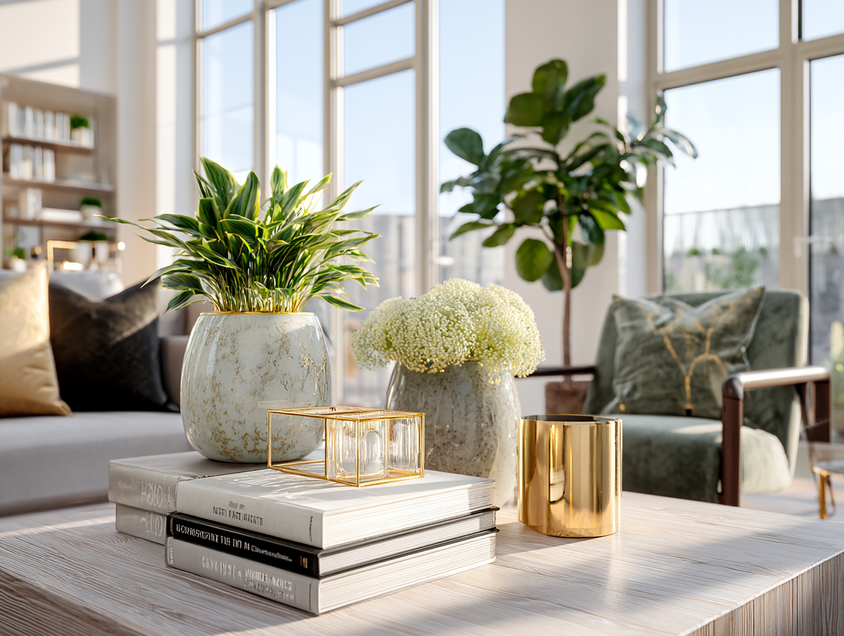

The Bold Decor is Back: How Home Décor Is Evolving in 2026 and Beyond
For nearly a decade, our homes were quiet and simple.
Ivory walls. Pale woods. Soft minimalism.
Spaces that felt elegant, clean, and undeniably refined, but also restrained.
Spaces that felt elegant, clean, and undeniably refined, but also restrained.
And while that era gave us calm, it also dulled something essential.
Emotion. Personality. Life.
As we move into 2026 and beyond, home décor is finally reclaiming what it once did so effortlessly in the 70s, 80s, and 90s:
self-expression, richness, and emotional depth — reimagined for modern life.
self-expression, richness, and emotional depth — reimagined for modern life.
This shift is about intention and self-expression.
Why This Shift Feels So Personal
Design always mirrors lifestyle.
And our lifestyles have changed dramatically.
- We work from home.
- We live vertically — in high-rises, condos, mixed-use buildings.
- Our homes serve as offices, sanctuaries, creative studios, and social spaces.
A neutral, trend-led interior no longer supports this complexity.
What we need now are homes that:
- Regulate our energy
- Reflect our identities
- Feel grounded yet inspiring.
This is where Mood & Materials becomes the foundation of modern décor.
Learning from the Past Without Repeating It
The resurgence of inspiration from the 70s, 80s, and 90s has come back.
Each of these eras understood something we temporarily forgot.
The 70s: Grounding Through Nature
The 70s were deeply tactile and earth-connected:
- Rich woods
- Warm, grounding colors
- Rounded, embracing forms
They prioritized comfort and emotional warmth — values that resonate strongly today.
The 80s: Confidence and Drama
The 80s reintroduced glamour:
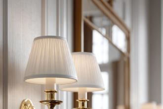
- Gold and brass
- Statement lighting
- Sculptural furniture
It wasn’t subtle — but it was intentional. Rooms had focal points and hierarchy.
The 90s: Identity and Collection
The 90s softened things again:
- Eclectic layering
- Books, art, global objects
- Homes that told stories
This era understood that a home should reflect who you are — not what’s trending.
2026 Décor Is a Curated Conversation Between Eras
Modern décor doesn’t recreate past decades — it edits them.
Instead of copying styles, we extract:
- The grounding of the 70s
- The confidence of the 80s
- The personality of the 90s
And we filter them through modern restraint.
The result?
Spaces that feel bold but composed, luxurious but livable.
Spaces that feel bold but composed, luxurious but livable.
The 2026 Color Story: Brown, Taupe & Burgundy
If the shift away from flat ivory has a palette, this is it. Brown, taupe, and burgundy share one powerful trait: they all belong to nature. From dark woods to clay, leather, earth, bark, and soil — these tones feel instinctively comforting, which is why they are so easy to live with.
Brown: The New Neutral
Brown isn’t just a color trend; it’s a psychological shift. After years of hyper-minimalism, people want their homes to feel like something again. Brown delivers exactly that: it’s grounding and calming, it connects effortlessly to nature, it adds visual weight without heaviness, and it feels timeless rather than trendy. Where ivory floated, brown anchors. And unlike grey — which often felt cold and corporate — brown brings warmth, maturity, and emotional comfort. This is why designers are calling brown the color of the decade.
Taupe: The Bridge
If brown is the hero, taupe is the bridge. Taupe sits beautifully between warmth and neutrality, making it the perfect starting point for homes transitioning away from pale palettes. Use taupe for walls and large surfaces, area rugs, upholstered seating, and curtains and soft architectural layers. Taupe allows you to build depth without committing to darkness. Think of taupe as the new canvas — not white.
Burgundy: The Strategic Accent
Where brown and taupe ground the space, burgundy introduces emotion. This isn’t a color to flood a room with; it’s a strategic accent that adds richness and drama without overwhelming. Burgundy works beautifully as a single statement chair or sofa, accent cushions or throws, artwork or ceramics, or dining room upholstery. Paired with brown, taupe, or ivory for brightness, burgundy feels luxurious, intentional, and grown-up — never flashy.
This palette feels warm year-round, ages beautifully, works across modern, classic, and transitional homes, and supports both minimal and layered styling. It’s not about trends — it’s about emotional longevity.
From Ivory to Color: A Slow, Elegant Transition
If your home is ivory-heavy and you’re sensing it feels flat, unfinished, or oddly uninspiring — you’re not imagining it. The good news? You don’t need to start over. This is how to transition from ivory to color slowly, elegantly, and intelligently.
Step One: Lay a Brown Foundation
Before you add color, you need a new neutral foundation — and that foundation is brown. Brown does what ivory used to do, but better: it grounds a space, adds depth, and instantly modernizes a room without feeling trendy. Start with the easiest swaps: brown or chocolate cushions on ivory sofas, dark wood accents, brown or espresso picture frames, or a brown-framed mirror instead of silver. Think of brown as your new baseline — from here, color feels intentional, not random.
Step Two: Choose One Elegant Color Story
Transitioning from ivory doesn’t mean adding color everywhere. It means choosing one refined direction and layering it slowly. If you want to stay close to neutrals, consider taupe, mushroom, soft caramel, or warm greige. If you’re ready for color, choose one or two of the following: burgundy or wine, sage or olive green, deep mocha, or muted terracotta. These colors are rich, grown-up, and timeless when used intentionally. Color should feel anchoring, not attention-seeking.
Step Three: Replace Silver With Gold
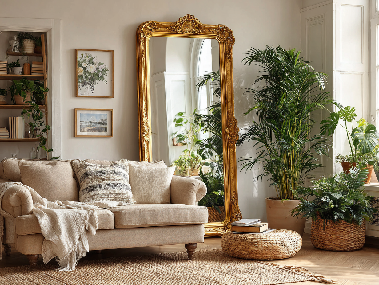
If ivory minimalism had one signature flaw, it was over-reliance on silver and chrome. In the new decor language, silver feels cold and disconnected, while gold — especially brushed or antique finishes — adds warmth and softness instantly. Upgrade selectively: gold-framed mirrors, brass or gold planters, gold trays on coffee tables, or warm metallic candle holders. You don’t need much — a few gold accents can completely recalibrate an ivory room.
Step Four: Add Color Through Books and Greenery
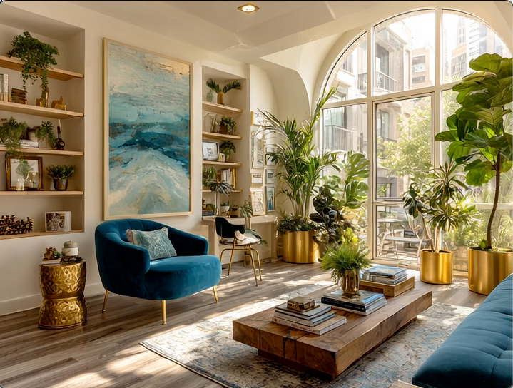
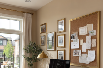
One of the most elegant ways to add color without commitment is through coffee table books — they add visual weight, intellectual character, and natural color variation, and they feel personal rather than decorative. Look for covers in brown, black, deep green, or burgundy. And if you add nothing else, add plants: greenery breaks the monotony of ivory instantly, introducing life, movement, and softness. For maximum impact, pair greenery with gold planters and use scale — one tall plant is better than five tiny ones.
Elegance never rushes. If you invested in an ivory home, honor that investment and let it evolve naturally: start with brown, layer color intentionally, replace cold metals, and add depth through books and plants. None of this needs to happen all at once — over time, your home doesn’t lose its calm; it gains its confidence.
Mood & Materials: The New Luxury Code
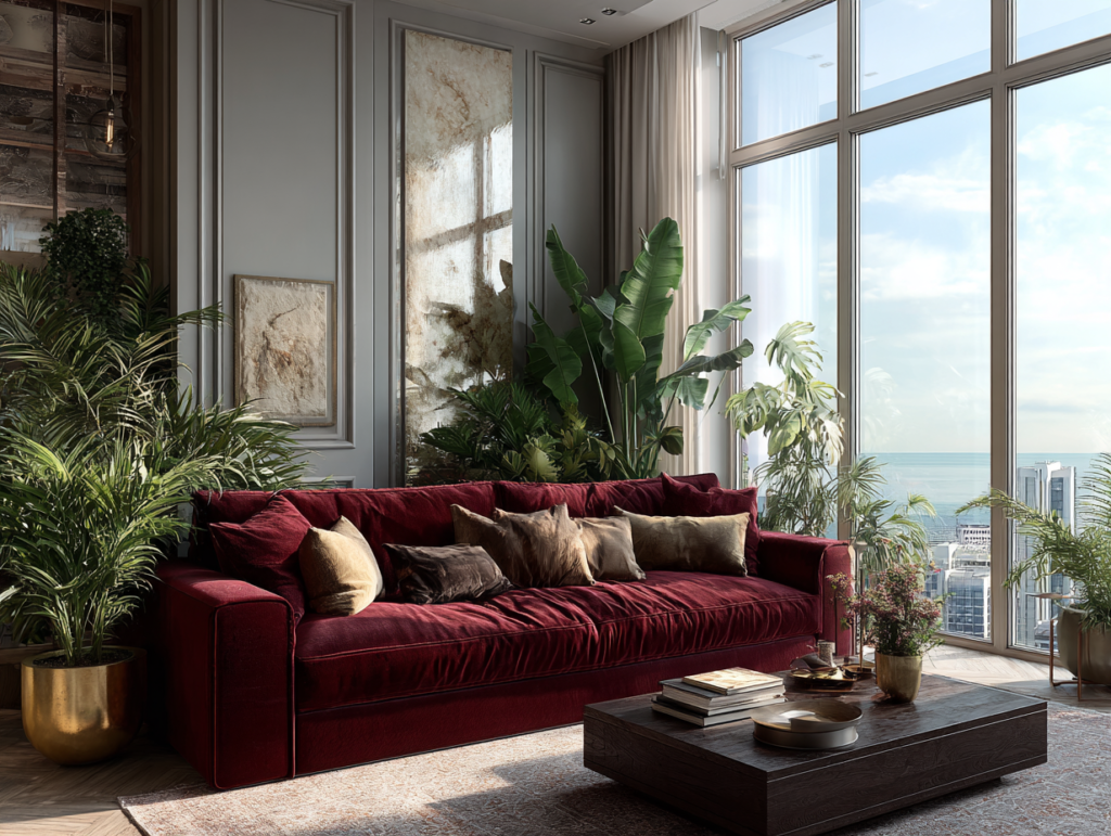
Luxury in 2026 is not about price or trend — it’s about how a space makes you feel.
Wood: Emotional Grounding
Wood has returned as a dominant material — but not bleached or washed out.
Think:
- Walnut
- Dark oak
- Warm, expressive grains
Wood anchors a space emotionally and energetically.
In Feng Shui terms, it connects to growth, stability, and natural balance.
In Feng Shui terms, it connects to growth, stability, and natural balance.
This is why wood works so beautifully in:
- Dining tables
- Desks
- Shelving
- Architectural details
It grounds modern life.
Shop Our Edit:
Velvet & Soft Textures: Emotional Comfort
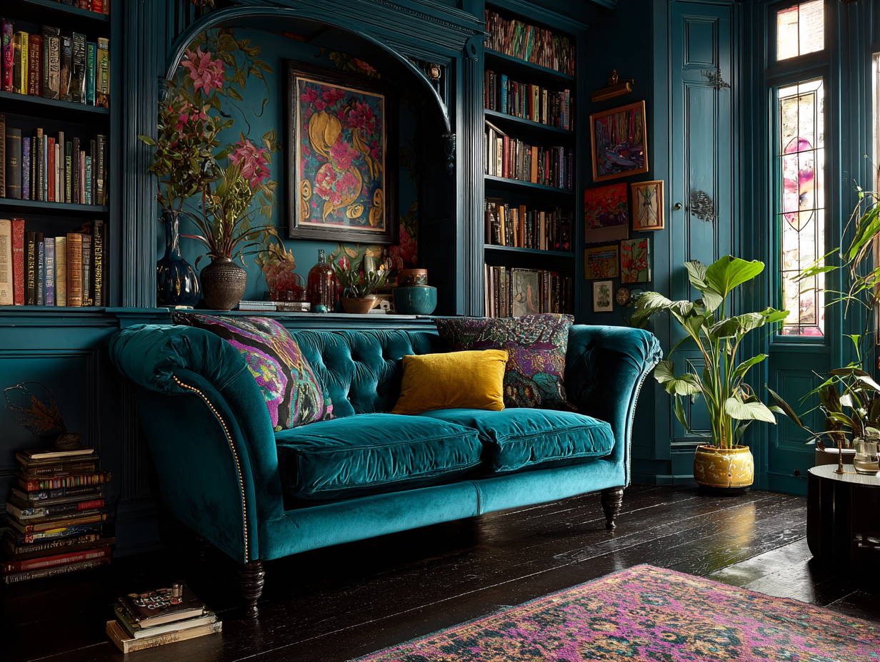
Velvet is no longer theatrical because it’s therapeutic.
In chairs, sofas, and accent pieces, velvet introduces:
- Softness
- Depth
- Quiet luxury
It absorbs light, softens lines, and invites stillness.
In homes where we spend long hours working and living, texture becomes emotional support.
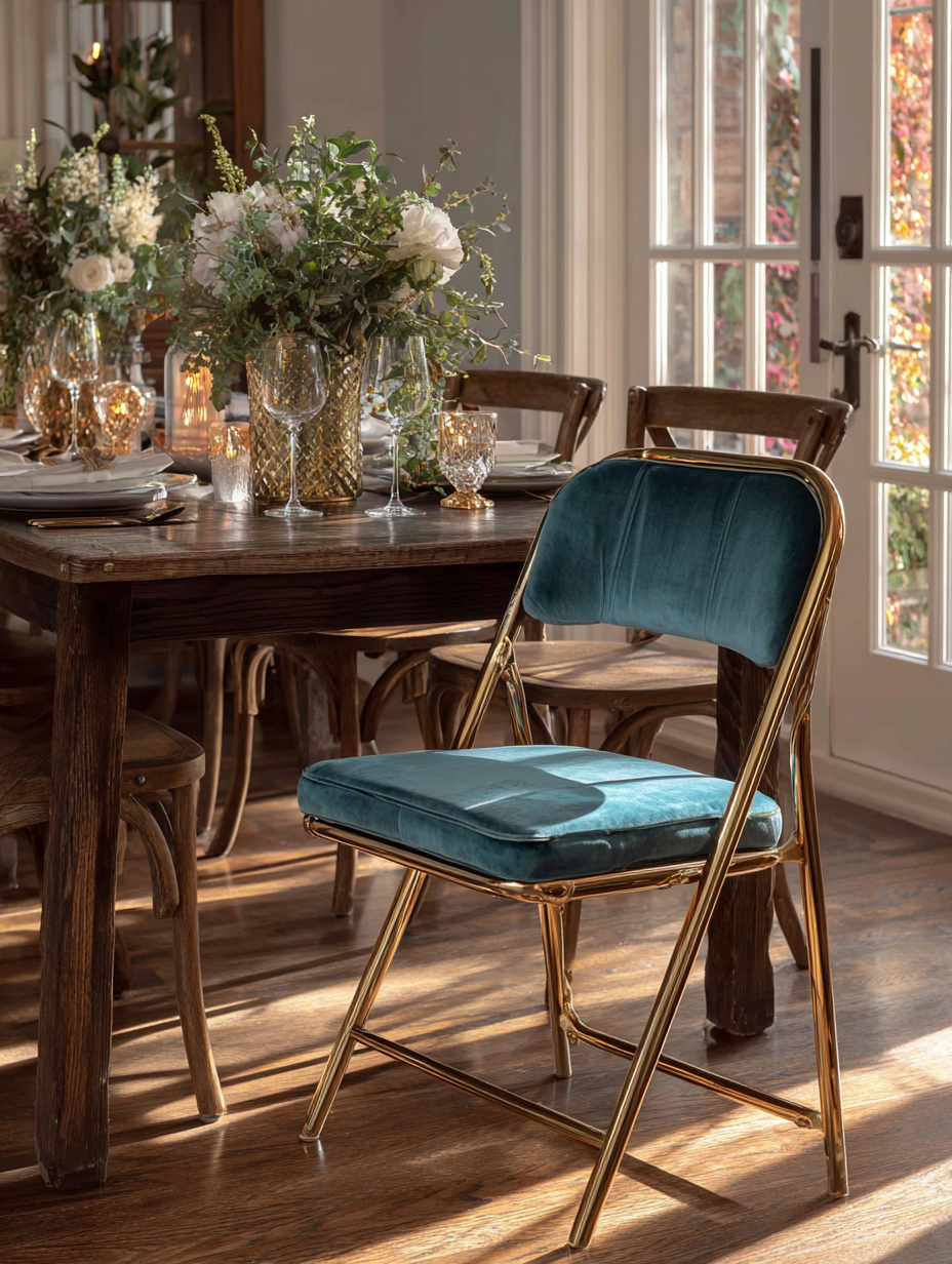
An updated folding chair with velvet because extra chair at the dining table doesn’t need to be boring.
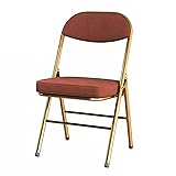
YCKEGEW Velvet Fabric Modern Folding Chair Padded Seat Folding Chair Dining Room Chair Gold Metal Frame,Study Chair for Adult Stackable Chair for Indoor and Outdoor Events (Color : Brown)
- [Comfortable And Stylish] -Our thickening padded folding chairs feature high-quality Velvet fabric and thick...
- [Comfy Chairs]: Ergonomic cushion back keep your back supported and aligned, the comfortable folding chairs...
Gold & Brass: Warm Energy, Not Flash
Gold accents are back, but aged, brushed, and intentional.
They bring:
- Warmth
- Light reflection
- Subtle richness
In Feng Shui, metallic elements balance heavier materials and enhance clarity.
Used sparingly, gold accents elevate without overwhelming.
One of the easiest ways to add warm Gold in your Decor: Gold planters, because Gold and Greenery are a gorgeous combination.
Shop Our Edit:


Flower Pots for Indoor & Outdoor Plants - Ceramic Pots 10 Inch, 8 Inch, 6 Inch with Drainage Holes, Saucers - Decorative Large Planters Set of 3 Gold 10+8+6 Inch Gold
- Different Sizes: The large planter pot (10" D X 7" H), medium planter (8" D X 6" H), and small plant pot (6" D...
- Drainage Holes and Accessories: Each ceramic plant pot has a drainage hole at the bottom, a mesh, and a...

Statement Pieces Are No Longer Optional
One of the biggest shifts in modern décor is the return of focal points.
Homes no longer need to be visually quiet everywhere.
Instead, they need anchors.
Statement pieces might include:
- A sculptural dining table
- A dramatic mirror – a must-have
- A bold bookshelf
- A striking light fixture
These pieces give the eye somewhere to rest — and the room a sense of purpose.
The key difference in 2026?
More than one statement per space — chosen with intention.
More than one statement per space — chosen with intention.
Intentional Decor: Homes as Identity
The most important change in modern décor isn’t visual, it’s philosophical. Your home decor is a conversation piece for your guests, to get to know you through the visuals.
Homes are no longer designed to impress strangers.
They’re designed to support the people living inside them.
They’re designed to support the people living inside them.
This means:
- Choosing objects for meaning, not trend
- Displaying books you’ve read and collected (I collect coffee table books)
- Keeping art that evokes emotion
- Letting your home evolve with you
Intentional décor recognizes that a home reflects a person’s mind, lifestyle, and values.

High-Rise Living & the New Urban Mood
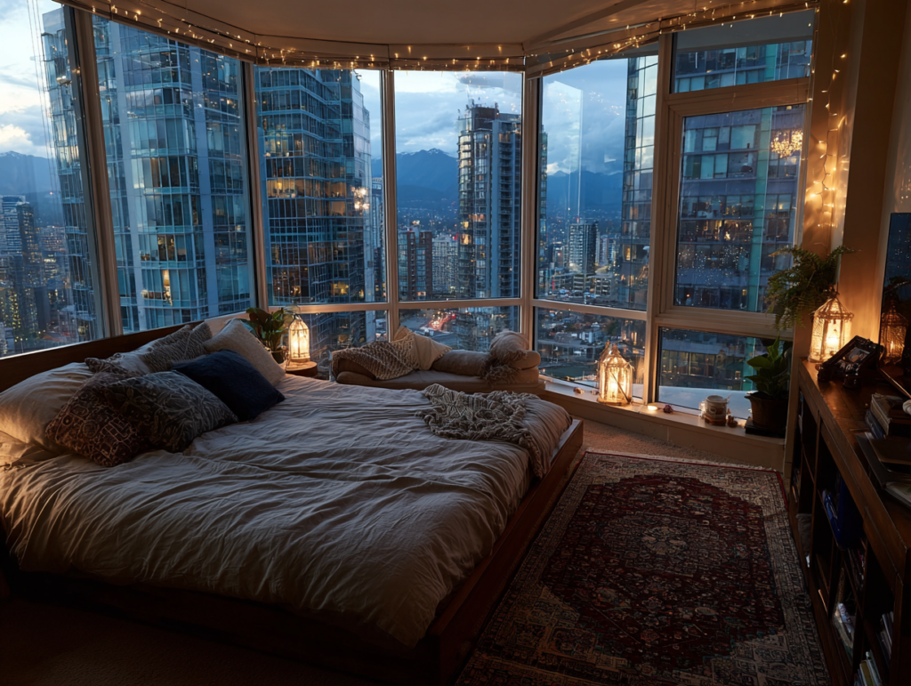
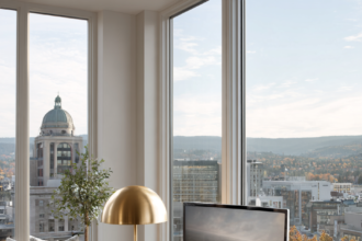
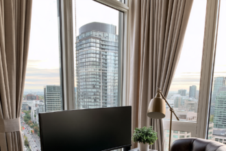
As more people live in condos and high-rise buildings, décor must counterbalance urban intensity.
This is why:
- Natural materials matter more.
- Warm lighting replaces harsh brightness.
- Texture replaces flat surfaces.
In smaller spaces, especially, the mood becomes everything.
A grounded dining table.
A velvet chair.
A single dramatic piece.
A velvet chair.
A single dramatic piece.
Luxury becomes concentrated, not spread thin.
What 2026 and Beyond Will Look — and Feel — Like
The future of home décor is not about trends.
It’s about resonance.
Homes will:
- Blend eras instead of copying them.
- Use materials to regulate emotion.
- Embrace boldness without chaos.
- Reflect personality without apology.
Minimalism won’t disappear — but it will soften.
Maximalism won’t dominate — but it will inform.
Maximalism won’t dominate — but it will inform.
The middle ground is where beauty lives.
The Elegant & Driven Home Philosophy (2026)
A beautiful home speaks — quietly, clearly, intentionally.
It is:
- Grounded in natural materials
- Elevated through thoughtful accents
- Anchored by statement pieces
- Guided by personal meaning
And above all, it is lived in.
Because elegance isn’t sterile.
And luxury isn’t empty.
And luxury isn’t empty.
In 2026 and beyond, the bold and the beautiful aren’t back —
They’ve evolved.
They’ve evolved.